Take your Excel skills to the next level! 🚀 You can find related examples and features on the right side of each chapterat the bottom of each chapter. Below you can find a complete overview.
1. Sort
- Custom Sort Order: You can use Excel to sort data in a custom order. In this example, we would like to sort by Priority (High, Normal, Low).
- Sort by Color: This example teaches you how to sort data by color in Excel.
- Reverse List: This article teaches you how to reverse the order of a list in Excel. For example, we want to reverse the list in column A.
- Randomize List: This article teaches you how to randomize (shuffle) a list in Excel.

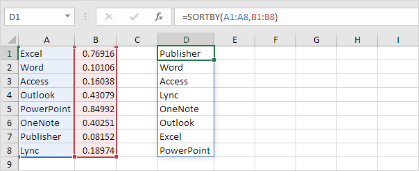
- SORT function: Use the magic SORT function in Excel 365/2021 to sort your Excel data by one column or multiple columns. Let's give it a try.
- Sort by Date: This guide walks you through the steps to sort by date in Excel. It starts with how to convert text-formatted dates to actual date values, followed by basic sorting methods and advanced techniques like sorting dates by month and sorting birthdays.
- Alphabetize: While sorting data alphabetically in Excel is easy, certain situations may require more advanced techniques to achieve the desired alphabetical order.
2. Filter
- Number and Text Filters: This example teaches you how to apply a number filter and a text filter to only display records that meet certain criteria.
- Date Filters: This page teaches you how to apply a date filter to only display records that meet certain criteria.
- Advanced Filter: This example teaches you how to apply an advanced filter in Excel to only display records that meet complex criteria.
- Data Form: The data form in Excel allows you to add, edit and delete records (rows) and display only those records that meet certain criteria. Especially when you have wide rows and you want to avoid repeated scrolling to the right and left, the data form can be useful.
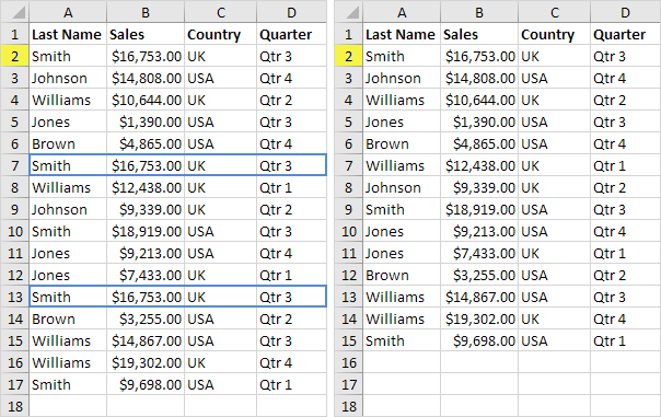
- Remove Duplicates: To quickly remove duplicates in Excel, use the tool on the Data tab. Use the Advanced Filter if you don't want to delete duplicates permanently.

- Outlining Data: Outlining data makes your data easier to view. In this example, we will total rows of related data and collapse a group of columns.
- Subtotal: Use the SUBTOTAL function in Excel instead of SUM, COUNT, MAX, etc. to ignore rows hidden by a filter or to ignore manually hidden rows.
- Unique Values: To find unique values in Excel, use the Advanced Filter. You can extract unique values or filter for unique values. If you have Excel 365 or Excel 2021, use the magic UNIQUE function.
- FILTER function: Use the magic FILTER function in Excel 365/2021 to extract records that meet certain criteria. The FILTER function is quite versatile.
3. Conditional Formatting
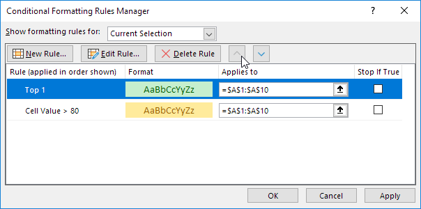
- Manage Rules: To view all conditional formatting rules in a workbook, use the Conditional Formatting Rules Manager. You can also use this screen to create, edit and delete rules.
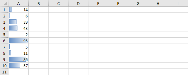
- Data Bars: Data bars in Excel make it very easy to visualize values in a range of cells. A longer bar represents a higher value.

- Color Scales: Color Scales in Excel make it very easy to visualize values in a range of cells. The shade of the color represents the value in the cell.
- Icon Sets: Icon Sets in Excel make it very easy to visualize values in a range of cells. Each icon represents a range of values.
- Find Duplicates: This page teaches you how to find duplicate values (or triplicates) and how to find duplicate rows in Excel.
- Shade Alternate Rows: This example shows you how to use conditional formatting to shade alternate rows.
- Compare Two Lists: This page describes how to compare two lists in Excel using conditional formatting and COUNTIF.
- Conflicting Rules: Sometimes multiple conditional formatting rules in Excel conflict. A higher rule always wins. This example illustrates two different results.

- Heat Map: To create a heat map in Excel, simply use conditional formatting. A heat map is a graphical representation of data where individual values are represented as colors.
4. Charts
- Column Chart: Column charts are used to compare values across categories by using vertical bars. To create a column chart, execute the following steps.
- Line Chart: Line charts are used to display trends over time. Use a line chart if you have text labels, dates or a few numeric labels on the horizontal axis.
- Pie Chart: Pie charts are used to display the contribution of each value (slice) to a total (pie). Pie charts always use one data series.
- Bar Chart: A bar chart is the horizontal version of a column chart. Use a bar chart if you have large text labels.
- Area Chart: An area chart is a line chart with the areas below the lines filled with colors. Use a stacked area chart to display the contribution of each value to a total over time.
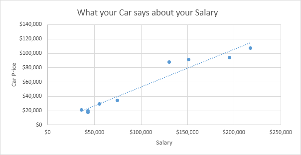
- Scatter Plot: Use a scatter plot (XY chart) to show scientific XY data. Scatter plots are often used to find out if there's a relationship between variables X and Y.

- Data Series: A row or column of numbers that are plotted in a chart is called a data series. You can plot one or more data series in a chart.
- Axes: Most chart types have two axes: a horizontal axis (or x-axis) and a vertical axis (or y-axis). This example teaches you how to change the axis type, add axis titles and how to change the scale of the vertical axis.
- Trendline: This example teaches you how to add a trendline to a chart in Excel.
- Error Bars: This page teaches you how to quickly add error bars to a chart in Excel, followed by instructions for adding custom error bars.
- Sparklines: Sparklines in Excel are graphs that fit in one cell. Sparklines are great for displaying trends. Excel offers three sparkline types: Line, Column and Win/Loss.

- Combination Chart: A combination chart is a chart that combines two or more chart types in a single chart.
- Gauge Chart: A gauge chart (or speedometer chart) combines a Doughnut chart and a Pie chart in a single chart. If you are in a hurry, simply download the Excel file.
- Thermometer Chart: This example teaches you how to create a thermometer chart in Excel. A thermometer chart shows you how much of a goal has been achieved.
- Gantt Chart: Excel does not offer Gantt as a chart type, but it's easy to create a Gantt chart by customizing the stacked bar chart type.
- Pareto Chart: A Pareto chart combines a column chart and a line graph. The Pareto principle states that, for many events, roughly 80% of the effects come from 20% of the causes.
5. Pivot Tables
- Group Pivot Table Items: This example teaches you how to group pivot table items. Learn how to group products and how to group dates by quarters.
- Multi-level Pivot Table: You can drag more than one field to an area in a pivot table. We'll look at an example of multiple row fields, multiple value fields and multiple report filter fields.
- Frequency Distribution: Did you know that you can use pivot tables to easily create a frequency distribution in Excel? You can also use the Analysis Toolpak to create a histogram.
- Pivot Chart: A pivot chart is the visual representation of a pivot table in Excel. Pivot charts and pivot tables are connected with each other.
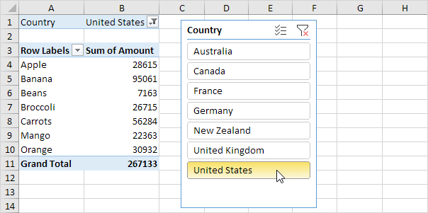
- Slicers: Use slicers in Excel to quickly and easily filter pivot tables. Connect multiple slicers to multiple pivot tables to create awesome reports.

- Update Pivot Table: Any changes you make to the data set are not automatically picked up by the pivot table. Refresh the pivot table or change the data source to update the pivot table with the applied changes.
- Calculated Field/Item: This example teaches you how to insert a calculated field or calculated item in a pivot table.
- GetPivotData: To quickly enter a GETPIVOTDATA function in Excel, type an equal sign (=) and click a cell in a pivot table. The GETPIVOTDATA function can be quite useful.
6. Tables
- Structured References: When working with tables in Excel, you can use structured references to make your formulas easier to understand.
- Table Styles: Quickly format a range of cells by choosing a table style. You can also create your own table style.
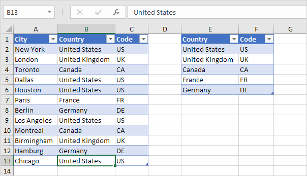
- Merge Tables: You can use tables and the VLOOKUP function in Excel to quickly merge two tables. This trick will bring your Excel game to a new level.

- Table as Source Data: One of the great things about tables in Excel is that you can use a table as source data for a chart, pivot table, etc.
- Remove Table Formatting: This article will explain how to remove two types of table formatting in Excel. You'll learn how to remove formatting from Excel tables and manually formatted data ranges.
- Quick Analysis: Use the Quick Analysis tool in Excel to quickly analyze your data. Quickly calculate totals, quickly insert tables, quickly apply conditional formatting and more.
7. What-If Analysis
- Data Tables: Instead of creating different scenarios, you can create a data table to quickly try out different values for formulas. You can create a one variable data table or a two variable data table.
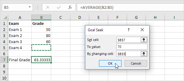
- Goal Seek: If you know the result you want from a formula, use Goal Seek in Excel to find the input value that produces this formula result.

- Quadratic Equation: A quadratic equation is of the form ax2 + bx + c = 0 where a ≠ 0. A quadratic equation can be solved by using the quadratic formula. You can also use Excel's Goal Seek feature to solve a quadratic equation.
8. Solver
- Transportation Problem: Use the solver in Excel to find the number of units to ship from each factory to each customer that minimizes the total cost.
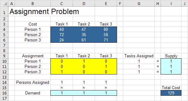
- Assignment Problem: Use the solver in Excel to find the assignment of persons to tasks that minimizes the total cost.

- Shortest Path Problem: Use the solver in Excel to find the shortest path from node S to node T in an undirected network. Points in a network are called nodes (S, A, B, C, D, E and T). Lines in a network are called arcs (SA, SB, SC, AC, etc).
- Maximum Flow Problem: Use the solver in Excel to find the maximum flow from node S to node T in a directed network.
- Capital Investment: Use the solver in Excel to find the combination of capital investments that maximizes the total profit.
- Sensitivity Analysis: Sensitivity analysis gives you insight into how the optimal solution changes when you change the coefficients of the model. After the solver found a solution, you can create a sensitivity report.
- System of Linear Equations: This example shows you how to solve a system of linear equations in Excel.
9. Analysis Toolpak
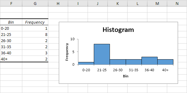
- Histogram: This example teaches you how to make a histogram in Excel.

- Descriptive Statistics: You can use the Analysis Toolpak add-in to generate descriptive statistics. For example, you may have the scores of 14 participants for a test.
- Anova: This example teaches you how to perform a single factor ANOVA (analysis of variance) in Excel. A single factor or one-way ANOVA is used to test the null hypothesis that the means of several populations are all equal.
- F-Test: This example teaches you how to perform an F-Test in Excel. The F-Test is used to test the null hypothesis that the variances of two populations are equal.
- t-Test: This example teaches you how to perform a t-Test in Excel. The t-Test is used to test the null hypothesis that the means of two populations are equal.
- Moving Average: Let's calculate the moving average of a time series in Excel. A moving average is used to smooth out irregularities (peaks and valleys) to easily recognize trends.
- Exponential Smoothing: Exponential smoothing is used to smooth out irregularities (peaks and valleys) to easily recognize trends.
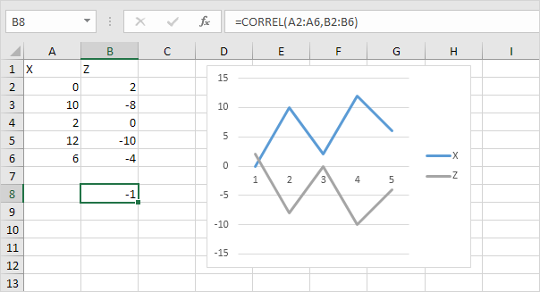
- Correlation: We can use the CORREL function or the Analysis Toolpak add-in in Excel to find the correlation coefficient between two variables.

- Regression: This example teaches you how to run a linear regression analysis in Excel and how to interpret the Summary Output.
Visit our next section: Excel VBA.
