Area Chart in Excel
An area chart is a line chart with the areas below the lines filled with colors. Use a stacked area chart to display the contribution of each value to a total over time.
To create an area chart, execute the following steps.
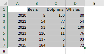
1. Select the range A1:D7.

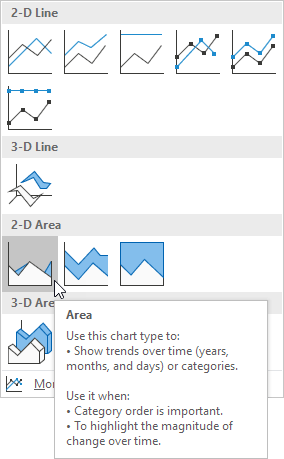
2. On the Insert tab, in the Charts group, click the Line symbol.

3. Click Area.

Result: in this example, some areas overlap.

Below you can find the corresponding line chart to clearly see this.

4. Change the chart's subtype to Stacked Area (the one next to Area).
Result:

Note: only if you have numeric labels, empty cell A1 before you create the area chart. By doing this, Excel does not recognize the numbers in column A as a data series and automatically places these numbers on the horizontal (category) axis. After creating the chart, you can enter the text Year into cell A1 if you like.